


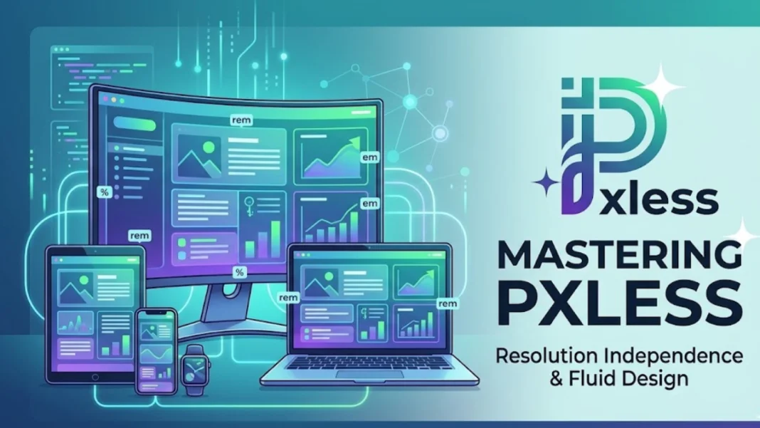
In the early days of the web, design was rigid. Pixels ruled everything—layouts, spacing, typography, and even user expectations. But as devices multiplied and screen sizes diversified, that rigidity began to break. Enter the idea of pxless—a concept that challenges pixel-dependent design and embraces fluid, scalable, and context-aware interfaces.
For startup founders, entrepreneurs, and tech professionals, pxless is more than a design trend. It represents a shift in how digital products are built, experienced, and scaled across platforms. In a world where users interact with applications on phones, tablets, desktops, wearables, and even smart TVs, relying on fixed pixel values is no longer sustainable.
The future belongs to systems that adapt—not ones that constrain.
What Pxless Means in Modern Design and Development
At its core, pxless refers to an approach to design and development that minimizes or eliminates reliance on fixed pixel units. Instead of defining layouts in rigid dimensions, pxless systems use relative units such as percentages, em, rem, viewport widths, and flexible grids.
This shift is not just technical—it’s philosophical. It moves design from a static mindset to a dynamic one.
In practical terms, a pxless approach ensures that interfaces scale naturally across devices. A button that looks perfect on a desktop should remain usable and visually consistent on a mobile screen, without requiring separate designs.
For developers, this means writing code that adapts to context. For designers, it means thinking in systems rather than fixed layouts.
Why Pxless Is Gaining Momentum
The rise of pxless design is driven by a simple reality: the digital landscape is no longer uniform. Users expect seamless experiences regardless of device, resolution, or orientation.
Several factors are accelerating this shift.
First, device diversity has exploded. From ultra-wide monitors to compact smartphones, the range of screen sizes continues to grow.
Second, responsive design has become the standard. Fixed layouts simply cannot keep up with dynamic user environments.
Third, accessibility requirements demand flexibility. Users with different needs rely on scalable interfaces that adapt to their preferences.
In this context, pxless is not just a preference—it is a necessity.
Pxless vs Pixel-Based Design: A Practical Comparison
To understand the value of pxless, it helps to compare it directly with traditional pixel-based design.
| Aspect | Pixel-Based Design | Pxless Design |
|---|---|---|
| Flexibility | Fixed and rigid | Adaptive and fluid |
| Device Compatibility | Limited | High across devices |
| Maintenance | Requires multiple breakpoints | Simplified with scalable units |
| Accessibility | Less adaptable | More user-friendly |
| Future Scalability | Challenging | Built for evolution |
This comparison highlights why many modern teams are moving toward pxless systems. The benefits extend beyond aesthetics—they impact performance, usability, and long-term maintainability.
The Role of Pxless in Scalable Product Design
For startups, scalability is everything. Products must evolve quickly, adapt to user feedback, and expand across markets. A pxless approach supports this by creating a flexible foundation.
When design systems are built without rigid constraints, they can accommodate new features, layouts, and use cases more easily. This reduces the need for constant redesign and refactoring.
In SaaS products, for example, dashboards often grow in complexity over time. A pxless system allows these interfaces to expand without breaking visual consistency.
For founders, this translates into faster iteration cycles and lower development costs.
Pxless and the Evolution of Design Systems
Design systems have become a cornerstone of modern product development. They provide a shared language for designers and developers, ensuring consistency across applications.
Pxless principles align naturally with this approach. Instead of defining components in fixed dimensions, design systems can use relative units and scalable patterns.
This creates components that are inherently adaptable. A card component, for instance, can adjust its size based on context without requiring multiple versions.
The result is a more efficient and cohesive system—one that supports both creativity and consistency.
Real-World Applications of Pxless Design
The impact of pxless can be seen across a wide range of digital products.
In e-commerce, flexible layouts ensure that product pages look great on any device, improving conversion rates.
In content platforms, scalable typography enhances readability across different screen sizes.
In mobile applications, adaptive interfaces provide a seamless user experience regardless of orientation or resolution.
These examples demonstrate that pxless is not limited to a specific industry. It is a universal approach that improves usability and performance across the board.
Challenges in Adopting a Pxless Approach
Despite its advantages, transitioning to a pxless system is not without challenges.
One of the biggest hurdles is mindset. Teams accustomed to pixel-based design may find it difficult to think in relative terms.
Another challenge is consistency. Without fixed dimensions, maintaining visual harmony requires careful planning and testing.
There is also the issue of legacy systems. Existing products built on pixel-based frameworks may require significant refactoring to adopt pxless principles.
Finally, tooling can be a limitation. Not all design and development tools fully support fluid, scalable workflows.
Addressing these challenges requires both technical expertise and cultural alignment within teams.
Best Practices for Implementing Pxless Design
For teams looking to adopt pxless, a strategic approach is essential.
Start by defining a scalable typography system using relative units. This creates a strong foundation for the entire interface.
Next, implement flexible grid systems that adapt to different screen sizes. This ensures consistent layout behavior.
Focus on component-based design. Build reusable elements that can adjust dynamically rather than relying on fixed dimensions.
Testing is also critical. Validate designs across multiple devices and scenarios to ensure consistency.
Finally, invest in education. Teams need to understand not just how to implement pxless, but why it matters.
Pxless and the Future of User Experience
As technology continues to evolve, the importance of pxless design will only increase. Emerging devices such as foldable screens, augmented reality interfaces, and wearable technology demand even greater flexibility.
In this future, fixed dimensions will become increasingly obsolete. Interfaces will need to adapt not just to screen size, but to context, environment, and user behavior.
Artificial intelligence may also play a role, enabling interfaces to adjust dynamically based on user preferences and usage patterns.
For founders and tech professionals, embracing pxless is a way to future-proof their products.
Conclusion
The concept of pxless represents a fundamental shift in how digital products are designed and built. It moves away from rigid, pixel-based constraints and toward flexible, scalable systems that adapt to the needs of modern users.
For startups and technology leaders, this approach offers clear advantages: improved usability, reduced maintenance, and greater scalability. It aligns with the realities of a multi-device world and prepares products for future innovation.
Adopting pxless is not just a technical decision—it is a strategic one. It reflects a commitment to building products that are not only functional, but resilient and adaptable.
In the end, the question is not whether to move beyond pixels, but how quickly you can make the transition.